Amoseeds packaging
Amoseeds delivers organic superfoods and dietary supplements through a direct-to-consumer e-commerce model, prioritizing natural ingredients and consumer trust. Their packaging strategy emphasizes branded, recyclable paperboard and flexible materials to align with sustainability and retail display standards.
Packaging Portfolio
Amoseeds utilizes a diverse portfolio combining retail paperboard cartons, flexible stand-up pouches, and corrugated shipping boxes. Cartons and pouches are primarily constructed from recyclable kraft and paperboard, often featuring resealable closures for product preservation. Visual branding is consistently integrated via full-color printed labels, organic certification marks, and product-specific graphics. The packaging mix is optimized for shelf visibility, e-commerce shipping resilience, and consumer sustainability expectations.
The packaging consists of a flat, smooth, single-layer paperboard carton that is primarily white with green accents. The front features a large, vibrant graphic of matcha powder, with the product name 'THÉ MATCHA' prominently displayed in bold, green font. Below the product name, there is additional text in smaller font indicating 'PREMIUM JAPONAIS EN POUDRE BIO.' The edges are clean and precise, with a glossy finish that enhances the visual appeal. The back of the carton likely contains product information and nutritional details, though not visible in the image.
The packaging consists of several retail cartons made of smooth, flat paperboard. Each box has clean edges and folds, with a lightweight appearance. The boxes are primarily in a kraft color with printed labels that feature vibrant graphics and text. The cartons are designed to stand upright and display the product information clearly on the front. The overall form is rectangular, suitable for retail display.
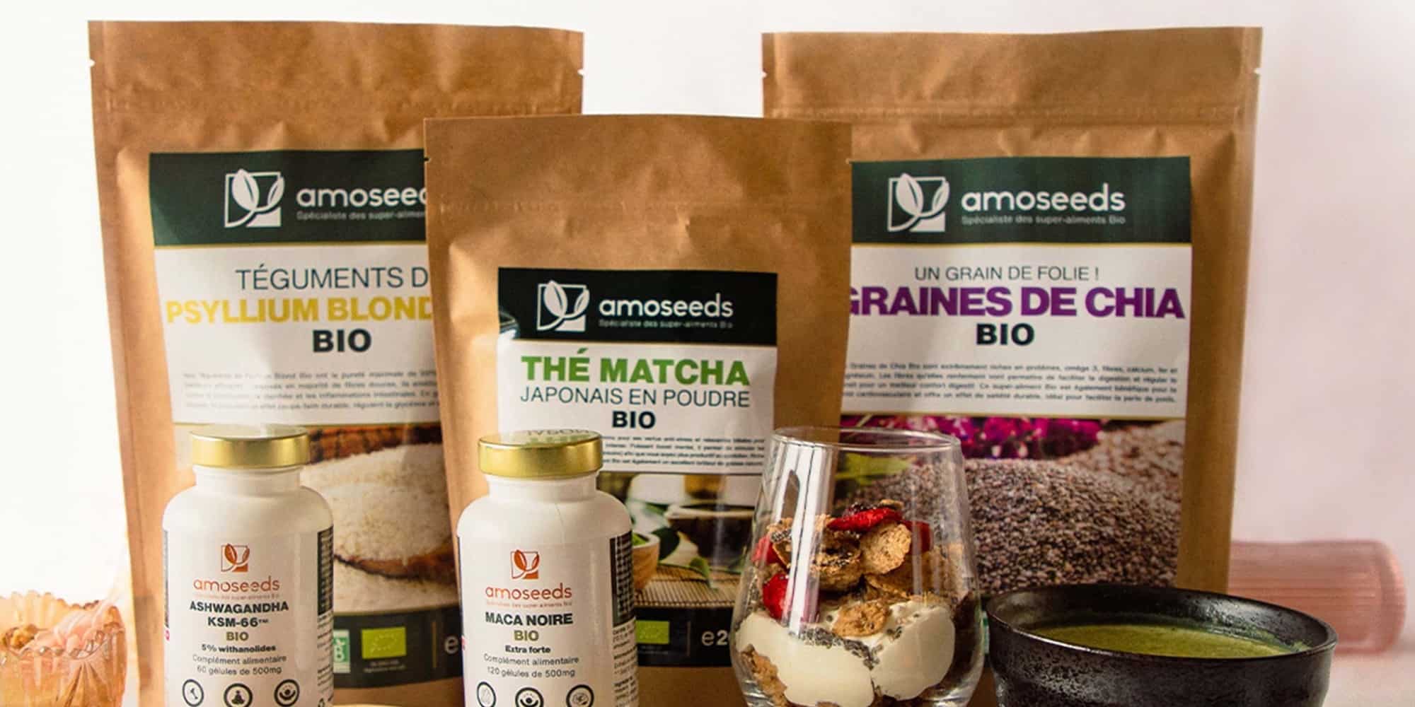
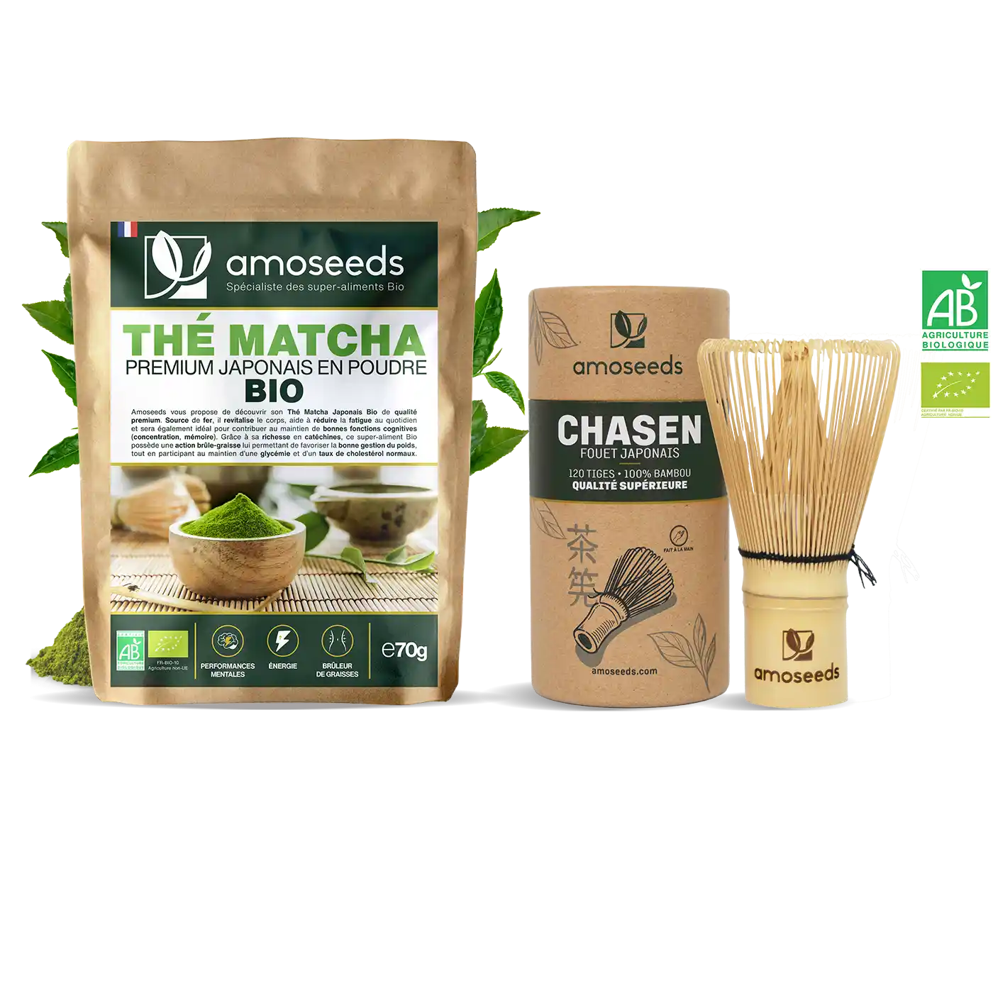
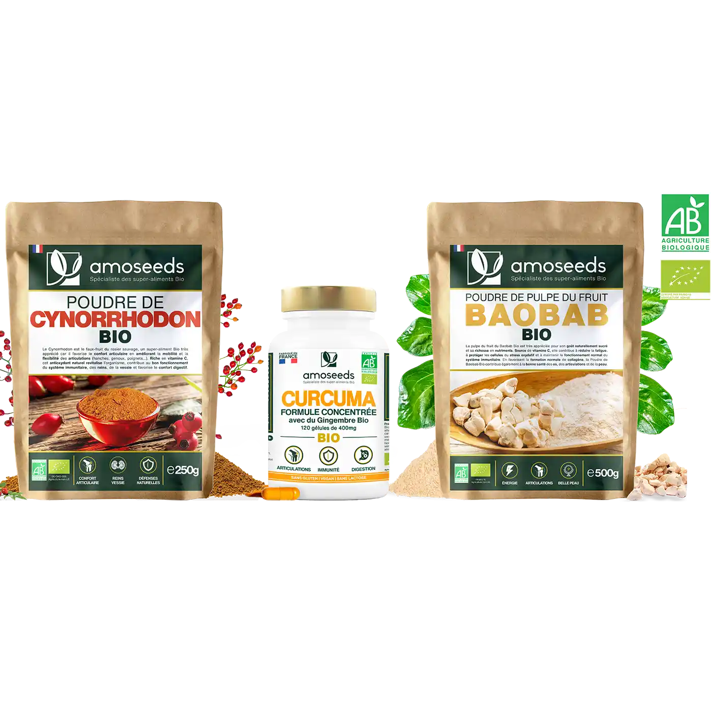
The packaging consists of several stand-up pouches made from a flexible material, likely a composite of plastic and foil for moisture barrier properties. Each pouch features a resealable zipper at the top, allowing for easy access and storage. The pouches are primarily brown kraft in color, giving a natural and organic appearance, with vibrant printed labels that include product information and branding elements. The labels are prominently displayed on the front, showcasing the product name and details in both English and French.
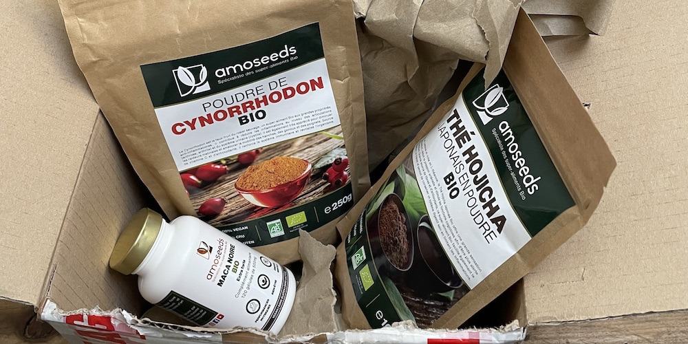
The packaging consists of a brown corrugated box with visible fluted layers when viewed from the side. The box has been opened, revealing its contents, which include two bags and a bottle. The exterior shows signs of handling, with slight crushing at the corners and edges. The box is secured with shipping tape, indicating its use for shipping purposes.
The packaging consists of three distinct items: two stand-up pouches and one jar. The stand-up pouches are made of a smooth, single-layer paperboard with a matte finish, featuring a resealable top. They have clear windows that allow visibility of the product inside. The jar is made of opaque plastic with a screw-on lid, displaying product information on the label. The overall design is clean and modern, with a focus on organic branding.

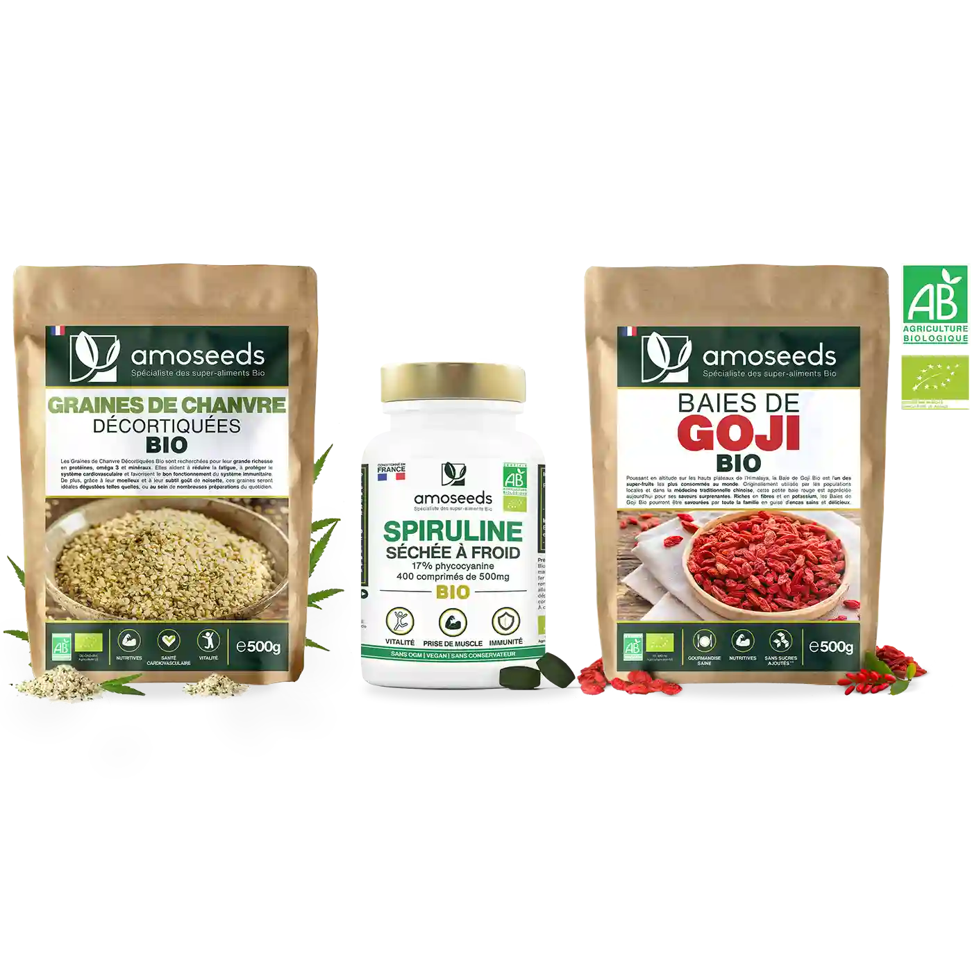
The packaging consists of three distinct items: two cylindrical bottles and one flat pouch. The bottles are made of white paperboard with a glossy finish, featuring smooth edges and precise folds. They are labeled with colorful graphics and text, while the pouch is a kraft paper bag with a matte finish, showcasing a clear window for visibility of the product inside. The overall appearance is clean and professional, suitable for retail display.
About the Brand
Amoseeds is a French health and wellness company specializing in organic superfoods, supplements, and herbal capsules, with a core focus on direct-to-consumer online sales and community-driven branding.
Founded in 2019, Amoseeds operates from Belfort, France, and has established a reputation for leveraging organic ingredients and transparent sourcing within the health supplement sector. The company’s packaging reflects its commitment to product integrity, with retail cartons, flexible pouches, and shipping boxes that reinforce both product safety and brand messaging. Their small team supports a streamlined operational model, emphasizing quality control and customer engagement through their packaging choices.
Key Differentiator: Amoseeds differentiates itself by combining organic product sourcing with cohesive, eco-conscious packaging that reinforces its brand identity and appeals to health-focused consumers.
Design System
Visual Style
Clean, modern typography paired with a natural, kraft-inspired color palette (browns, whites, greens) and vibrant accent graphics for product differentiation. The aesthetic is minimalist, prioritizing clarity and organic cues.
Brand Identity
Consistent use of the Amoseeds logo, standardized iconography for certifications, and clear product naming. Visual elements are harmonized across SKUs to reinforce brand recognition and trust.
Packaging Design
Focus on recyclable and compostable paperboard, flexible pouches with moisture barriers, and structurally robust corrugated boxes. Design philosophy centers on material efficiency, protective structure, and clear product communication.
User Experience
Packaging supports the customer journey through visible freshness, ease of opening (resealable pouches), and prominent display of health credentials, enhancing both unboxing satisfaction and post-purchase usability.
Company Metrics
Business insights for Amoseeds based on available data
Market Positioning
Brand Values & Focus
Key Competitors
Target Market: Health-conscious consumers in France and Europe seeking organic superfoods, dietary supplements, and wellness products via direct online channels.
Packaging Assessment
Overall Grade
Visual appeal and presentation quality
Packaging durability and protection
Eco-friendliness and recyclable materials
Cost efficiency and value for money
Packaging assessment for Amoseeds based on industry standards and best practices
Frequently Asked Questions
What materials does Amoseeds use in its packaging?
Amoseeds primarily utilizes recyclable paperboard cartons, flexible stand-up pouches with moisture barriers, and corrugated cardboard shipping boxes, all selected for product protection and alignment with sustainability goals.
How does Amoseeds ensure packaging sustainability?
The company prioritizes recyclable and kraft-based materials, minimizes excess packaging, and uses printed labels to communicate organic certifications and eco-conscious values.
How does packaging contribute to the Amoseeds brand experience?
Packaging design is integrated with the brand’s visual identity, featuring consistent logos, color schemes, and product transparency to enhance consumer trust and unboxing satisfaction.
Discover other Health companies
Explore more companies in the health industry and their packaging strategies
Smart Protein
Health
Smart Protein is dedicated to transforming nutrition by providing a range of health and wellness products focused on protein supplements and vitamins.
Comvita
Health
Comvita is a New Zealand-based company specializing in high-quality Mānuka honey and natural health products. Established in 1974, it aims to connect people with the healing power of nature.
Doctor Seaweed
Health
Doctor Seaweed specializes in natural, plant-based nutritional supplements derived from seaweed, aimed at promoting overall wellness.